Author guest post: Caroline Roope
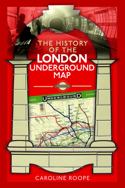
The History of the London Underground Map
Love it or hate it, many of us have at some point in our lives braved a trip on the London Underground. Whether you navigated it with ease or found yourself squinting confusedly at one of the poster maps emblazoned on the wall, trying to make sense of the numerous lines and their even more numerous stations, we can be certain of one thing – the Underground wouldn’t be the Underground without its famous ‘map.’*
Unbelievably, this icon of transport navigation was originally designed on a scrap of notepad paper, for fun, by an out-of-work employee called Henry (Harry) Beck. Despite the Underground being in existence since 1863, it took seventy years for the network to successfully map its lines, connections and stations in a way that made sense. Beck’s diagram was finally introduced to the travelling public in 1933, and all subsequent Underground maps have been based on its basic design principles since – with varying degrees of success, depending on who was holding the pen!
But why did it take so long? And why was it such an impossible task? The answer lies in the development of the Underground itself. The modern network, as it is today, works as a cohesive system under its parent organisation – Transport for London – making for a much easier job in terms of maps and marketing for TfL and a much easier travelling experience for its passengers. But in 1863, when the first line – the Metropolitan – was opened, hotly followed by a rival line – the District – in 1868, cohesion was the last thing on everybody’s minds. Instead, the two companies went head-to-head, disagreeing with each other’s decisions, vying for each other’s passengers with ever-more confusing marketing, and generally making a nuisance of themselves above and below ground, at the expense of the people they relied on to keep operating – the passengers. During this time, both companies would produce their own maps using a rudimentary approach that involved simply overlaying the route of the line on top of a street map. This was tricky due to issues with scaling and legibility, but both companies also went out of their way to ensure that their rival line was missing entirely from their own map and marketing literature in a game of cartographic one-upmanship. The two companies called a truce for as long as it took to join their two respective lines together – which would eventually become the Circle line – and then it was back to the usual bickering, and a total lack of clarity for passengers.
The heady days of the nineteenth century’s ‘Railway Mania’ provided plenty of opportunities for industrialists and businessmen on the make to invest, and the Metropolitan and District were soon joined by other companies carving out their own slices of subterranean London. During the final decades of the nineteenth century the Metropolitan and District lines were joined by the new deep-level Tubes; the City and South London Railway (now part of the Northern line) opened in 1890, followed by the Waterloo and City line in 1898 and the Central line in 1900. Additional routes such as the Hampstead line (now part of the Northern line), the Bakerloo and the Piccadilly came into being in the first decade of the new century – with all the pomp and ceremony you would expect in the famously decorous Edwardian age. The new lines had their own distinct architecture, signage and branding – and as expected, an entirely different approach to managing the experience of their passengers, due in no small part to the influence of American businessman Charles Yerkes, whose company came to own the majority of the new ‘Tube’ lines.
The new century also ushered in a new way of thinking about the Underground network. Attitudes towards its piecemeal development were beginning to wear thin – not least of all for it’s ever-suffering passengers, who for the previous forty years had been forced to navigate a system that was disjointed, fragmentary and chaotic. In 1902, a new company headed up by Charles Yerkes was formed – the Underground Electric Railways Company of London – the UERL, or (even better) the Underground, which over the next ten years would come to consolidate all the disparate routes, barring the Metropolitan, who would prove to be a little more stubborn. It is the UERL that we must thank for the first legible map that details the Underground it its entirety. Produced in 1908, its design foreshadows that of Beck’s 1933 masterpiece, although the street detail is still in evidence, and the lines are yet to be straightened and given Beck’s classic geometric treatment.
Despite some initial ‘hiccups’ involving vast sums of debt, dodgy dealings and a sensational courtroom suicide (more on this in my book), the UERL would come to thrive, under the steadying hand of general manager Albert Stanley, and commercial manager Frank Pick. Fortunately for the Underground users of the early twentieth century, the two men had an inherent understanding of how to improve the passenger experience and entice people down into the bowels of London. In a flurry of artistic and design genius, in which stations were tiled, posters were commissioned, roundels were created, and signage was standardised – the Underground brand was finally born. The UERL also got a new name – the Combine – although that was superseded in 1933 by the London Passenger Transport Board which absorbed not only the UERL but the rest of London’s transport offering.
And it was into this melting pot of modernity in 1933 that Beck’s map found it’s home and slotted right in. Just as Stanley and Pick were tidying up the network and making it fit for modern civic life, Beck was tidying up the lines, experimenting with scale and attempting to rationalise on paper the tangle of routes snaking in every direction under London’s feet. No one asked him to do it – he did it because he thought he could do it better and make it easier to understand. And in that respect, he was proved right. To say it was a huge achievement is an understatement. That we can still download a tube map to our smart phones based on Beck’s paper and ink design principles of almost a century ago is testament to not only to its cultural worth, but also, its usefulness. And that’s the mark of a fantastic piece of information design.
You can find out more about the how London Underground developed, it’s artistic and design heritage, and of course it’s famous ‘map’ in my new book, ‘The History of the London Underground Map.’
*Map is a common misnomer, but the Underground ‘map’ isn’t a map at all. According to the experts, and Beck himself, it’s a schematic diagram. But as TfL know, map is more user-friendly, so ‘Tube map’ has stuck.
The History of the London Underground Map is available to order here.